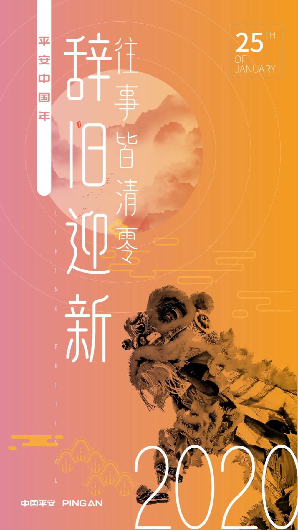
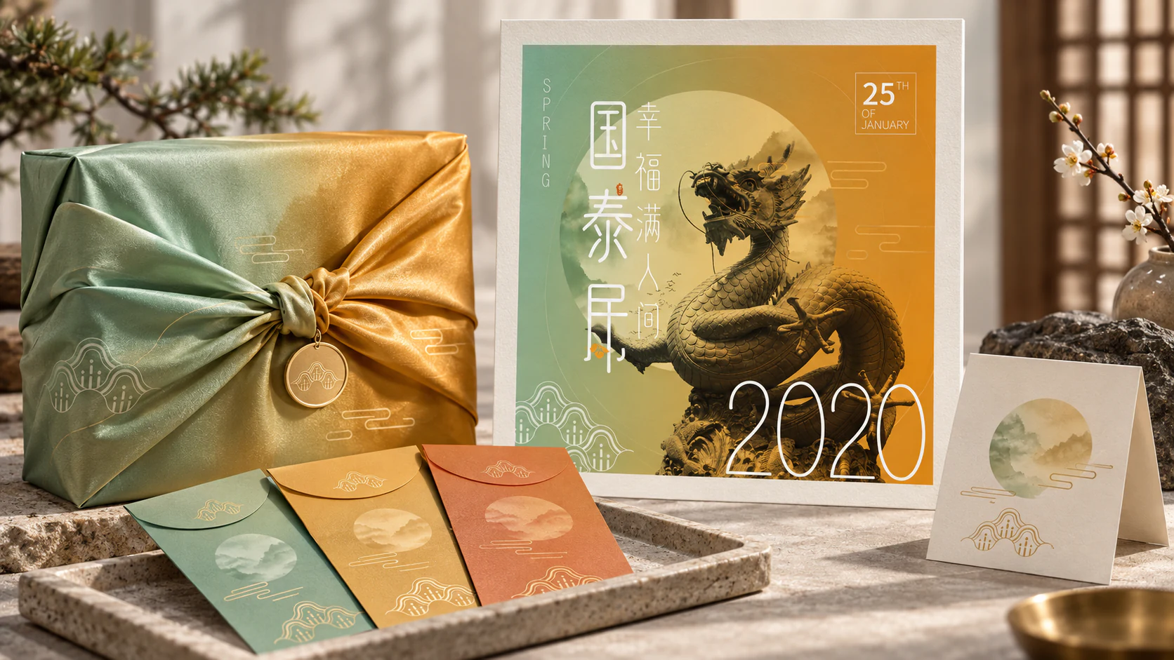
Spring Festival Gift Set
An independent packaging study based on the original poster’s jade-to-amber field, circular moon form and fine linework. The campaign artwork moves naturally onto a wrapped gift, envelopes and an archival print without reducing the celebration to generic red-and-gold decoration.
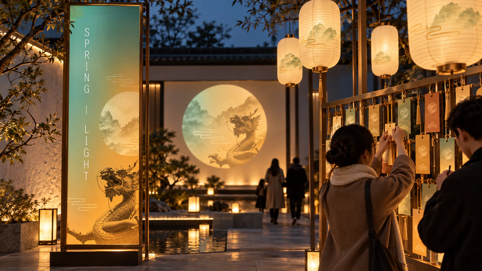
A Lantern Route for Spring Light
This independent public-space study lets the poster leave the wall and become an evening route. The original circular landscape becomes a lantern window; its fine cloud lines travel across signs, wish cards and soft pools of light. Instead of using the familiar festival shorthand of loud red and gold, the jade-to-amber field provides a slower transition from dusk to welcome. A visitor can read the identity from the far end of a courtyard, then discover smaller details while leaving a wish. The design works as orientation, participation and atmosphere at once, turning a seasonal graphic into something people can walk through.
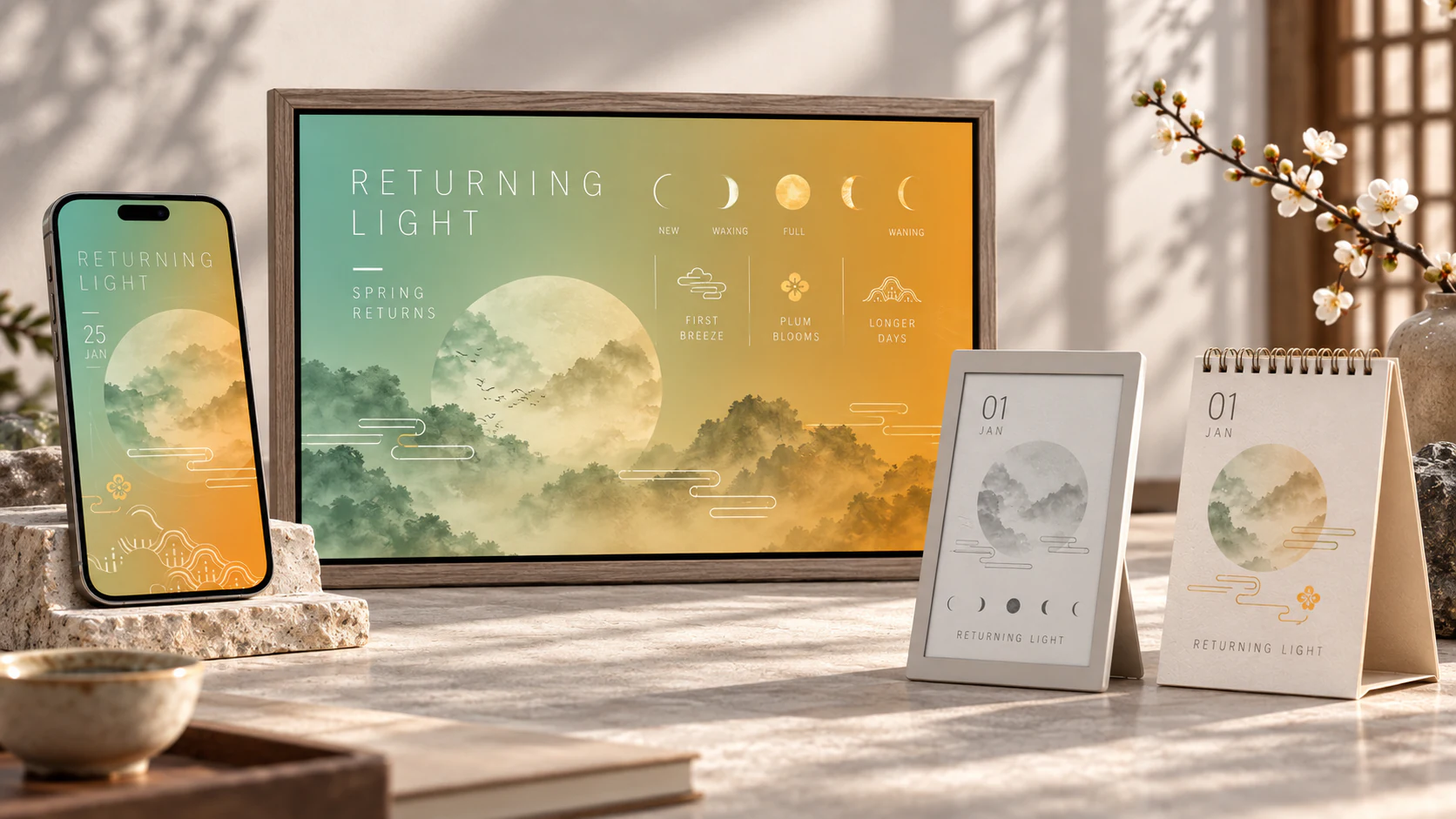
A Calendar of Returning Light
This independent digital study asks whether a festival identity can stay present after the one big night is over. The moon disc, ink-wash landscape and cloud-line motifs become a quiet calendar of lunar phases, early blossom and lengthening days. Rather than squeezing a poster onto a screen, the system uses time itself as a layout principle: the colour field shifts gradually, the moon fills and empties, and brief seasonal markers appear only when needed. The same language can live on a phone, an e-ink object or a printed desk calendar. It makes the identity feel less like an annual announcement and more like a small instrument for noticing spring arrive.
A Feast of Small Rituals
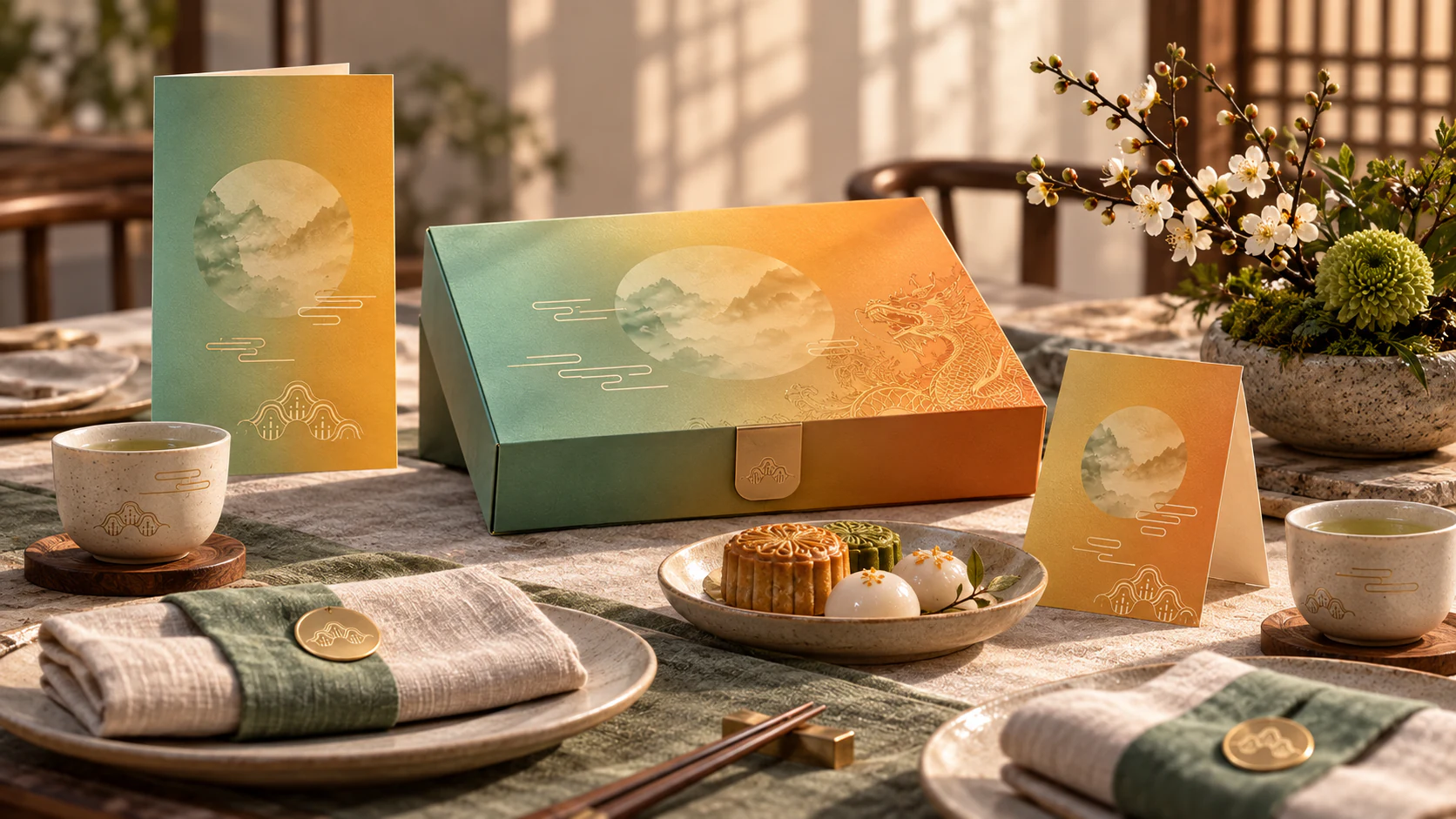
This independent hospitality study moves the poster’s visual ingredients to the scale of a shared table. A circular mountain window becomes a menu cue and box aperture; white cloud lines create a gentle rhythm across ceramic, linen and folded cards; an embossed dragon detail rewards close looking. The palette remains jade and amber, but is carried by paper, stoneware and fabric rather than a flat campaign field. The aim is not to turn every object into a souvenir. It is to create a set of small signals that make a meal feel considered before the first dish arrives. The identity becomes a host: present, graceful and never too loud.
Night Procession
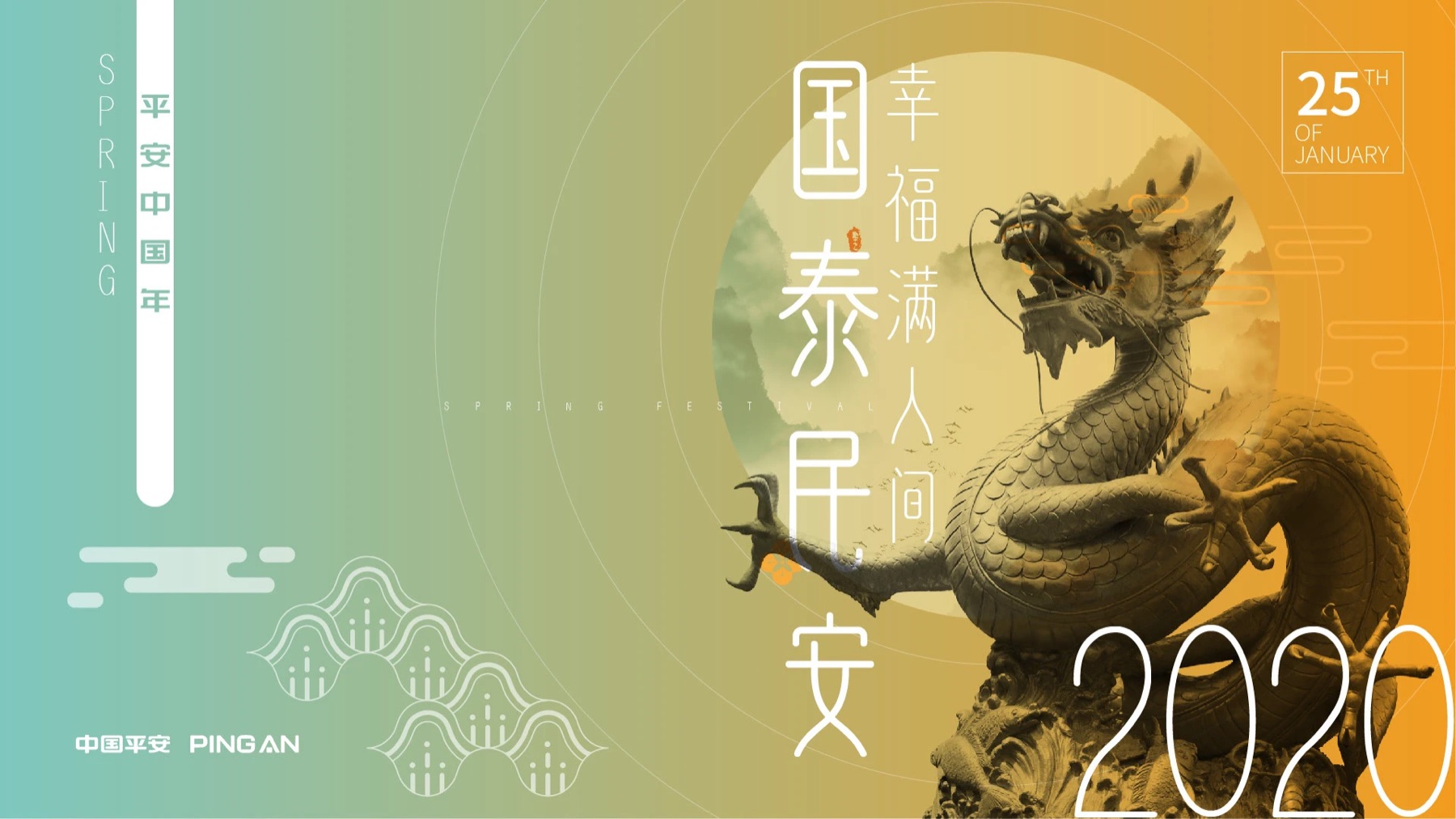
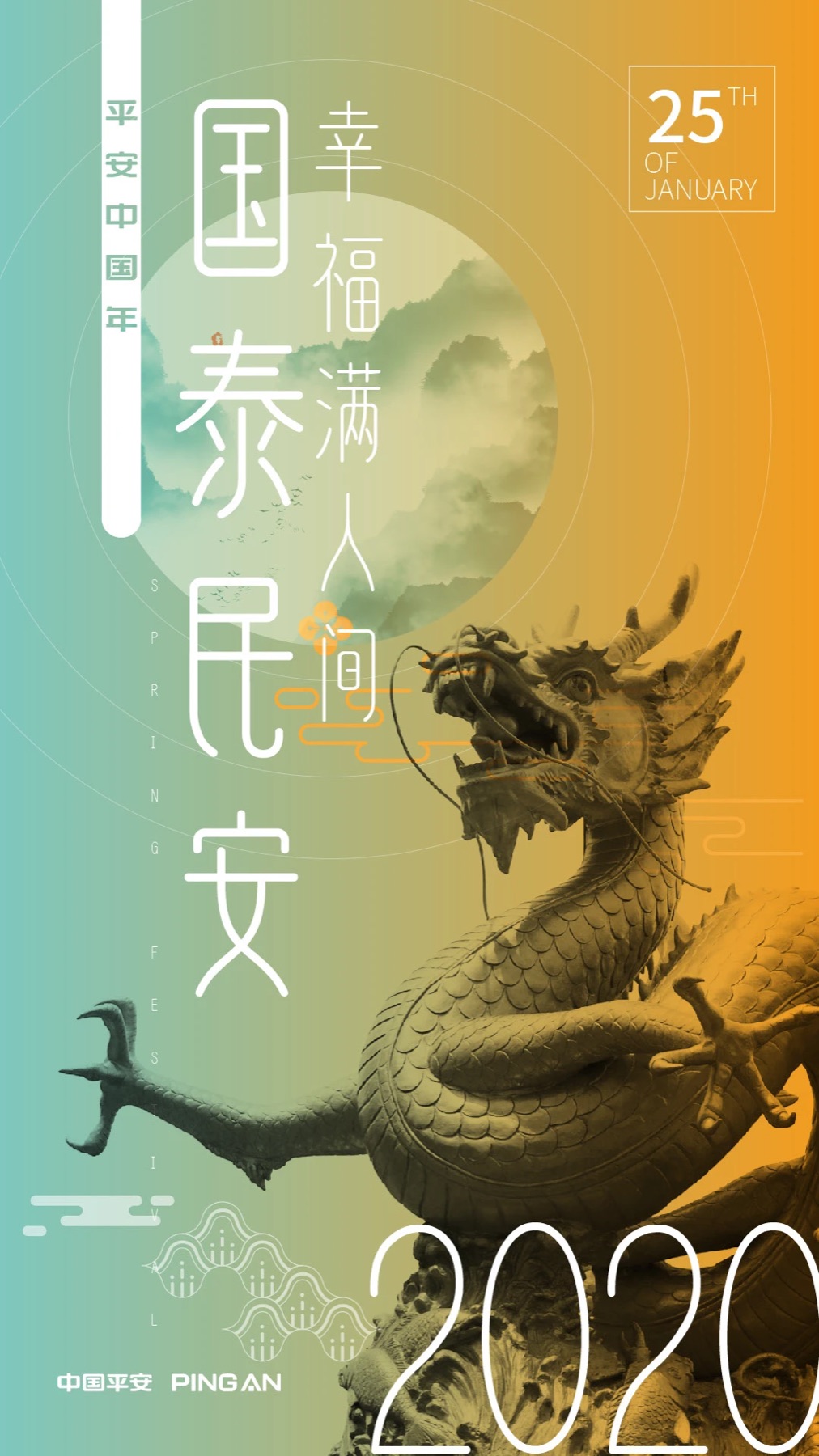
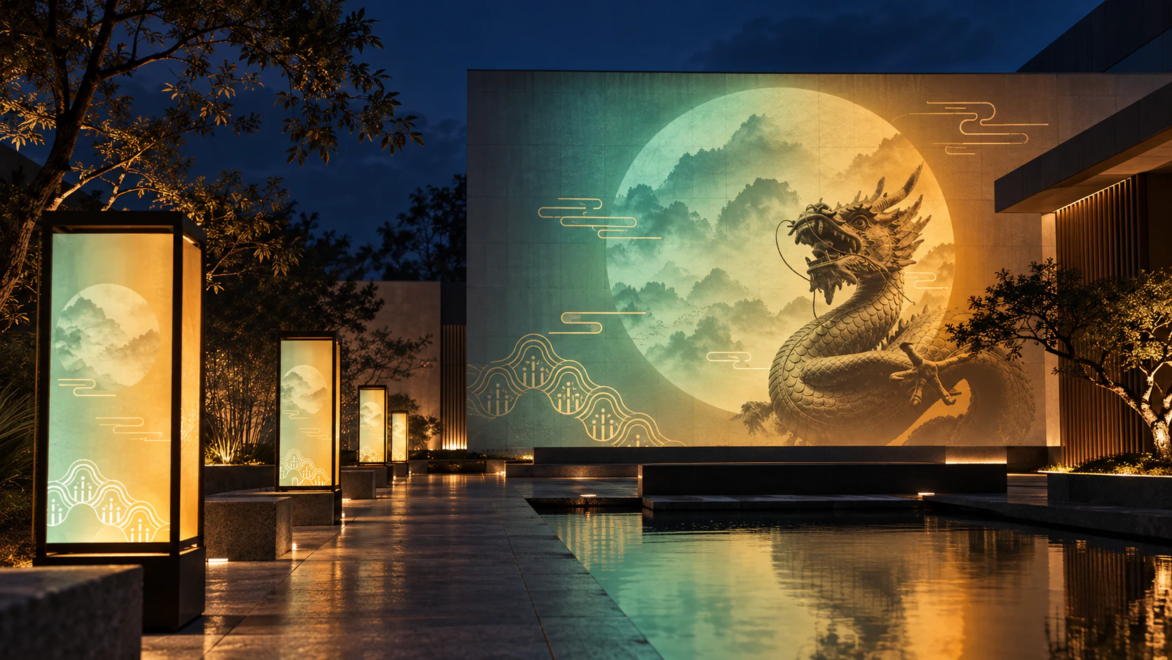
This independent projection study develops the poster into a slow public performance. The original dragon is no longer an illustration placed beside type; it becomes a measured silhouette moving through a circular field of mountain mist. Lantern columns extend the frame across a courtyard, making the route legible without turning it into a spectacle of competing screens. Jade and amber provide depth against the indigo evening, while the familiar cloud lines work as a visual tempo between large gestures. The design argues for a different kind of festival monument: not an object demanding attention, but a temporary atmosphere that lets architecture, water and people share the same image.
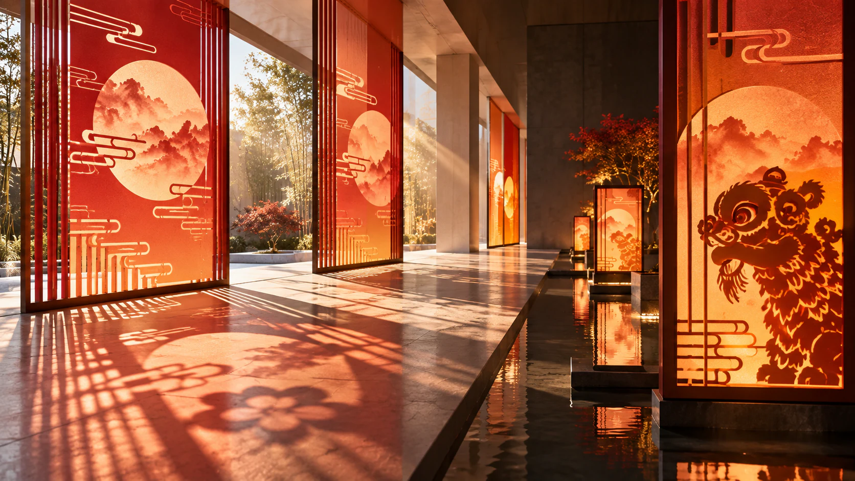
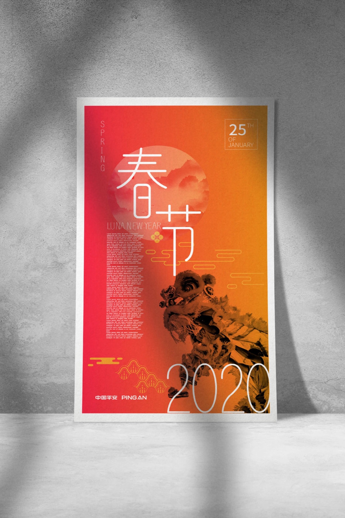
Red Light, Cut Slowly
This independent installation develops the poster’s paper-cut language into light, shadow and architectural scale. Layered red forms animate as visitors move past the windows, connecting the intimacy of handmade cutting with the pace of a public street. The extension keeps the original graphic economy while letting time and imperfect edges become part of the image.