Global 2020 Conference Kit
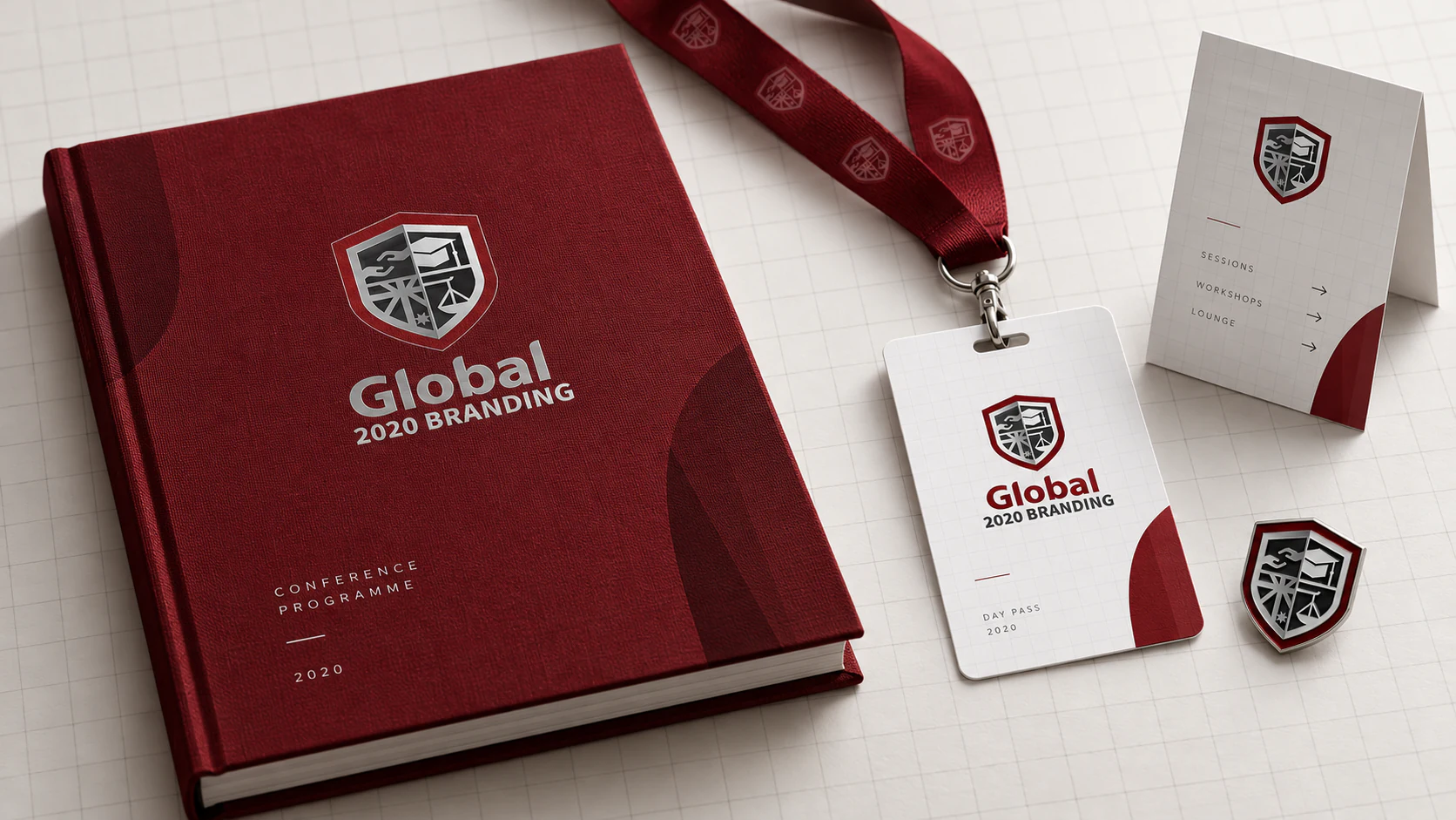
An independent application study for a formal academic event: a cloth-bound programme, lanyard pass, wayfinding card and enamel pin. The original redesign balances two impulses that are often treated as opposites: the inherited authority of a shield and the openness of a contemporary grid. These objects keep that tension intact. Burgundy provides continuity and ceremony; white space, clear numbering and modest scale make the system approachable. The crest is used as a signature rather than wallpaper, allowing each item to feel related without requiring every surface to repeat the full identity.
Editorial Architecture
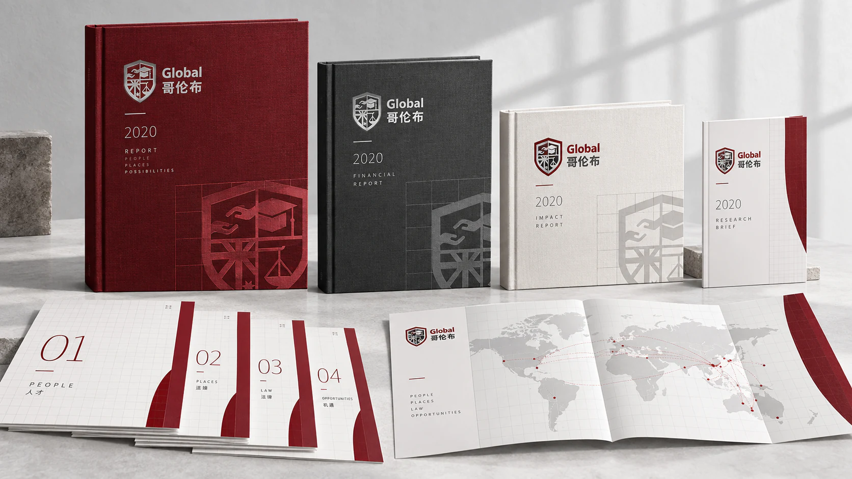
This independent publication study treats the brand guide’s grid as an editorial structure rather than a background motif. A family of reports changes scale, colour balance and section rhythm while retaining one recognisable architecture. The shield’s four fields become a method for organising themes; enlarged fragments create quiet cover imagery without introducing unrelated decoration. Burgundy volumes carry institutional weight, graphite supports technical material, and white editions leave room for research and reflection. The aim is consistency without monotony: readers should recognise the family immediately, then understand the purpose of each publication before opening it.
A Bilingual Building
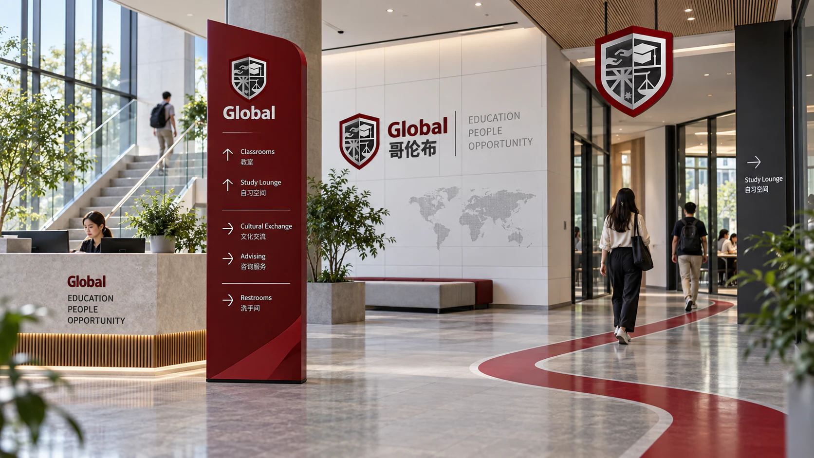
A global education identity has to work when language, scale and familiarity vary from visitor to visitor. This independent wayfinding study uses a continuous burgundy path as the first layer of information, directional arrows and room groupings as the second, and bilingual names as the third. The shield’s internal divisions inform the shape of freestanding directory blades and suspended markers, connecting the environment to the identity without turning the lobby into a giant logo. Curved red edges soften the formality of the grid. The building remains calm, but its routes become legible before every word has been read.
Knowledge Exchange Portal
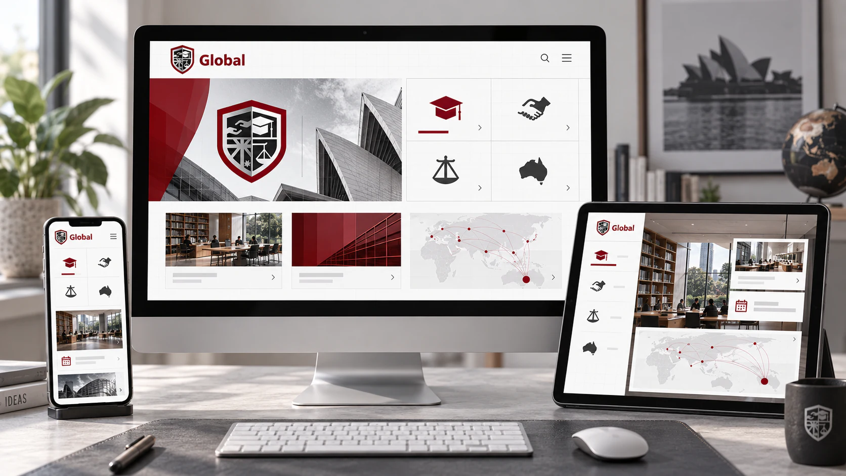
This independent digital study translates the shield from an emblem into an information model. Its four fields become stable routes through learning, exchange, governance and Australian context, giving a diverse content library a memorable structure. The print grid becomes responsive: broad and editorial on desktop, compact and sequential on mobile. Burgundy is reserved for active states, connections and decisions, while most of the interface remains white and graphite. The design avoids the usual dashboard habit of making every number compete for attention. Authority here comes from hierarchy and restraint, not from filling the screen.
The Exchange Commons
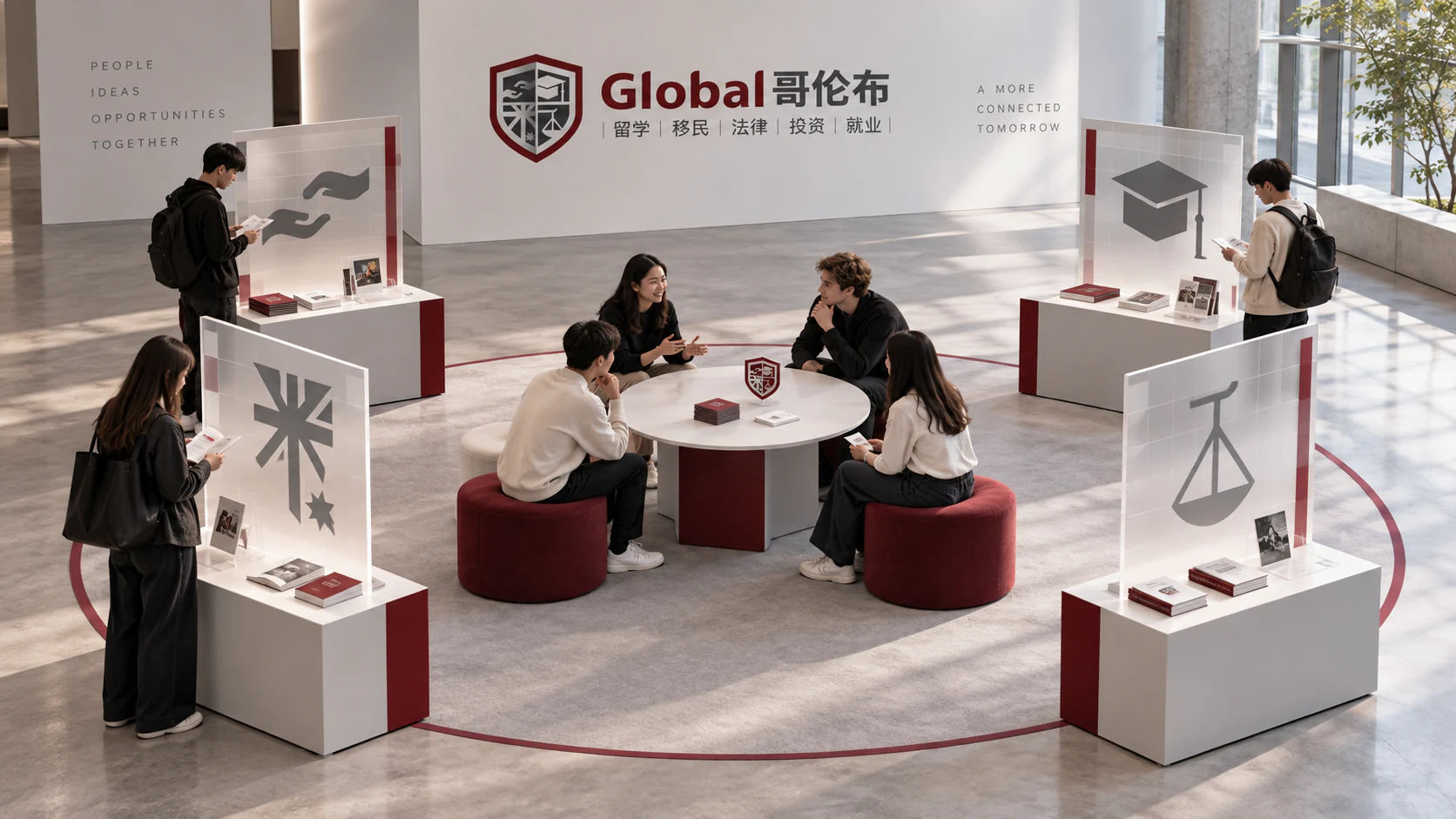
Global identity is often illustrated with maps and flags; this independent spatial study takes a more human view. Four translucent stations, derived from the shield’s internal fields, lead visitors toward a shared round table. Each station introduces one area of knowledge, while a thin burgundy line connects them as a continuous route. The central space is deliberately the least branded part of the installation, because conversation is the outcome and the graphics are only the invitation. The design turns an identity about international connection into a small piece of social choreography: approach separately, gather together, then leave by another path.
The Conference Has Two Rooms
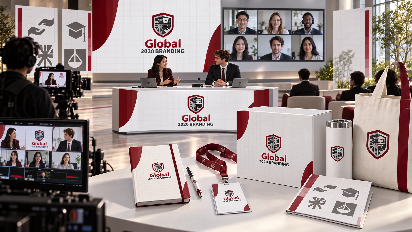
This independent hybrid-event study extends the original identity across a physical venue and a remote broadcast. Graphic bands, participant windows and stage architecture share one visual tempo, so neither audience feels like an afterthought. The identity becomes connective tissue between arrival, presentation, discussion and replay. It is a speculative application, not part of the original client delivery.
Knowledge Worth Keeping
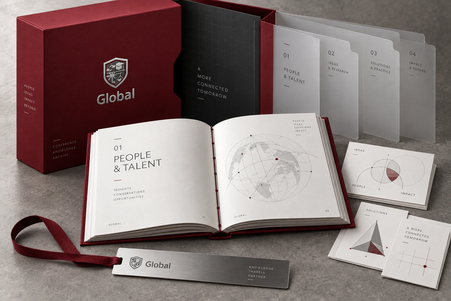
This independent publication concept explores the life of a conference after its final session. Burgundy cloth, silver details and the original shield establish continuity, while translucent dividers turn subjects into physical layers that can be compared and rearranged. A sewn volume holds the longer argument; loose diagram cards invite notes and conversation. The material hierarchy follows the information hierarchy: durable outside, open and generous within. The aim is an object worth returning to, with enough quiet space for the reader to disagree in the margins. These are speculative applications of the identity, rather than a record of a produced conference archive.