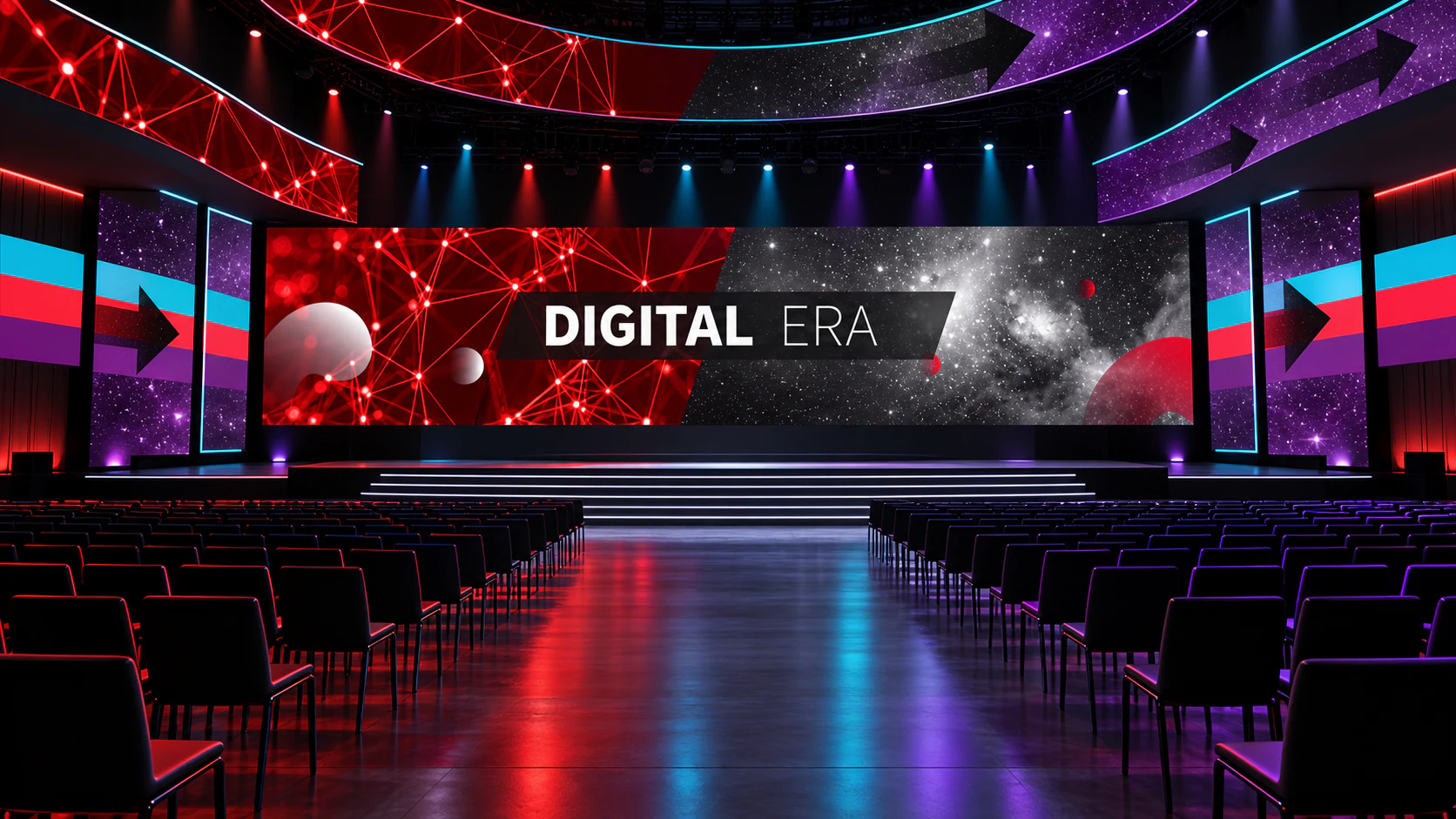
Data Theatre
This independent event-environment study lets DDD China operate at architectural scale. Crimson networks, cyan and purple bands, black title planes and directional arrows become a sequence around a conference stage rather than a single hero screen. The system is built for movement: a speaker sees broad fields from the stage; an arriving audience reads the route in peripheral vision; a camera can find a new composition from almost any seat. The colours keep their original intensity, but the spacing gives them room to breathe. It shows how a motion-first graphic language can organise a room without reducing the room to an LED backdrop.
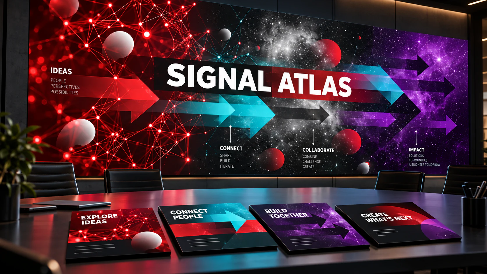
Signal Atlas
This independent information-design study turns the campaign’s high-energy visual vocabulary into an instrument for explaining collaboration. Network fields introduce connections, coloured arrows distinguish directions of effort, and black translucent bands give changing information a stable place to land. The goal is not a conventional dashboard. It is a shared map for a room full of people whose ideas, decisions and disciplines move at different speeds. By carrying the original visual rhythm into large walls and compact workshop cards, the identity shows that density can be made navigable without becoming dry.
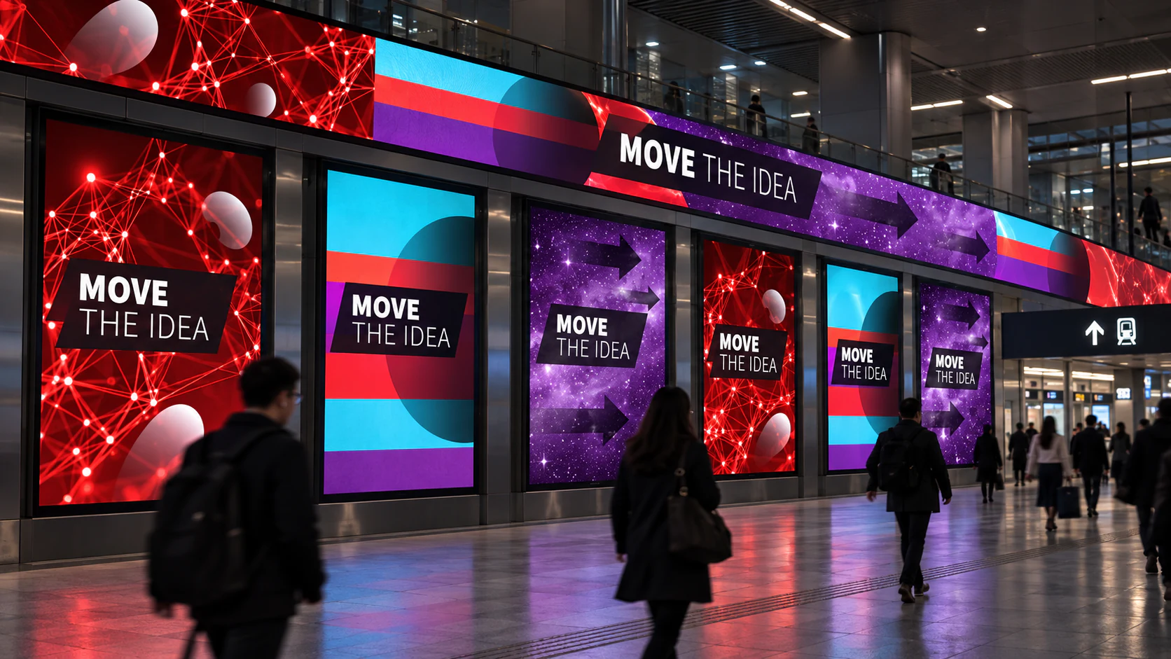
A City of Signals
This independent motion-campaign study places the DDD China system where rhythm matters most: a fast public route. Each screen becomes one frame in a longer sequence, alternating network density, broad colour bands, arrow direction and typographic interruption. A person walking through the concourse encounters change rather than repetition, while the limited palette keeps the message connected from one display to the next. The study treats motion design as an editorial problem: what should be shown now, what can wait for the next screen, and how much uncertainty keeps a familiar system alive? The answer is a campaign that moves without shouting.
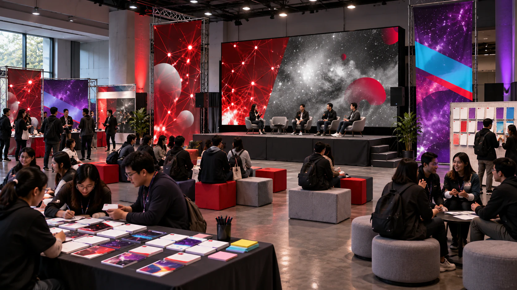
The Collaboration Field Guide
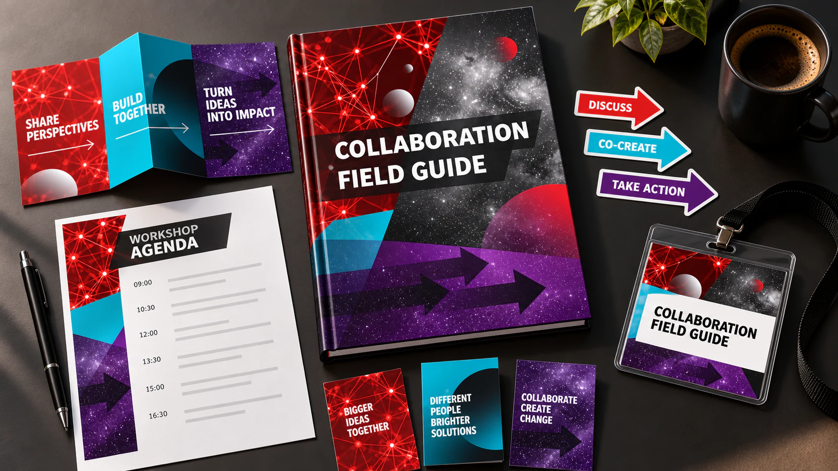
This independent workshop-tool study brings the DDD China language down from the screen to the working table. A folded guide, agenda cards, directional stickers and badge use the same bands and arrows to help a group progress from sharing perspectives to making choices. The large graphic moves have a practical job: colours establish a stage of discussion, arrows signal a decision path, and the dark panel protects short pieces of language from the surrounding visual noise. The result treats conference material as an active tool rather than a souvenir. It is designed to become marked up, passed around and folded into a pocket.
Common Ground
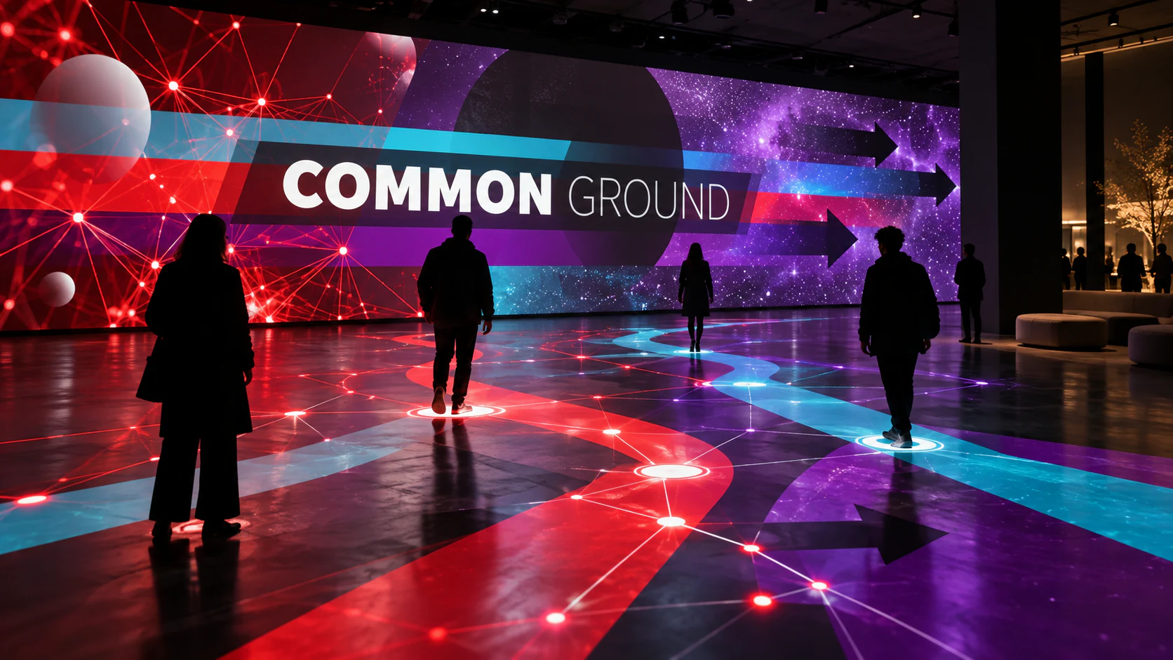
This independent interactive study asks the identity to react to the people it is trying to connect. Visitors cross a projected field of routes and signal nodes; their presence causes paths to gather, diverge and temporarily reveal shared territory. The red, cyan and purple flows preserve the source campaign’s sense of directional force, while the black arrow forms stop the room becoming a generic light show. What matters is the metaphor: collaboration is not a perfectly straight line, but an environment in which different trajectories can be made visible. The system turns an abstract topic into a spatial experience without pretending that technology alone creates agreement.
A Conference Built to Travel
This independent event extension turns the identity into a reusable kit of stage pieces, signs and registration tools. Components pack flat, recombine for different venues and preserve a recognisable rhythm without repeating one backdrop. The visual system behaves like good conference infrastructure: visible when it helps, quiet when conversation should take over.