
Lettergarden / The Fitting Room
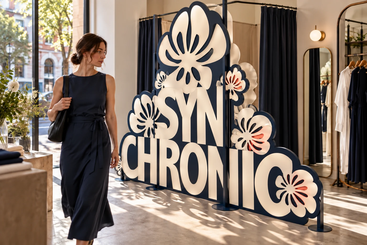
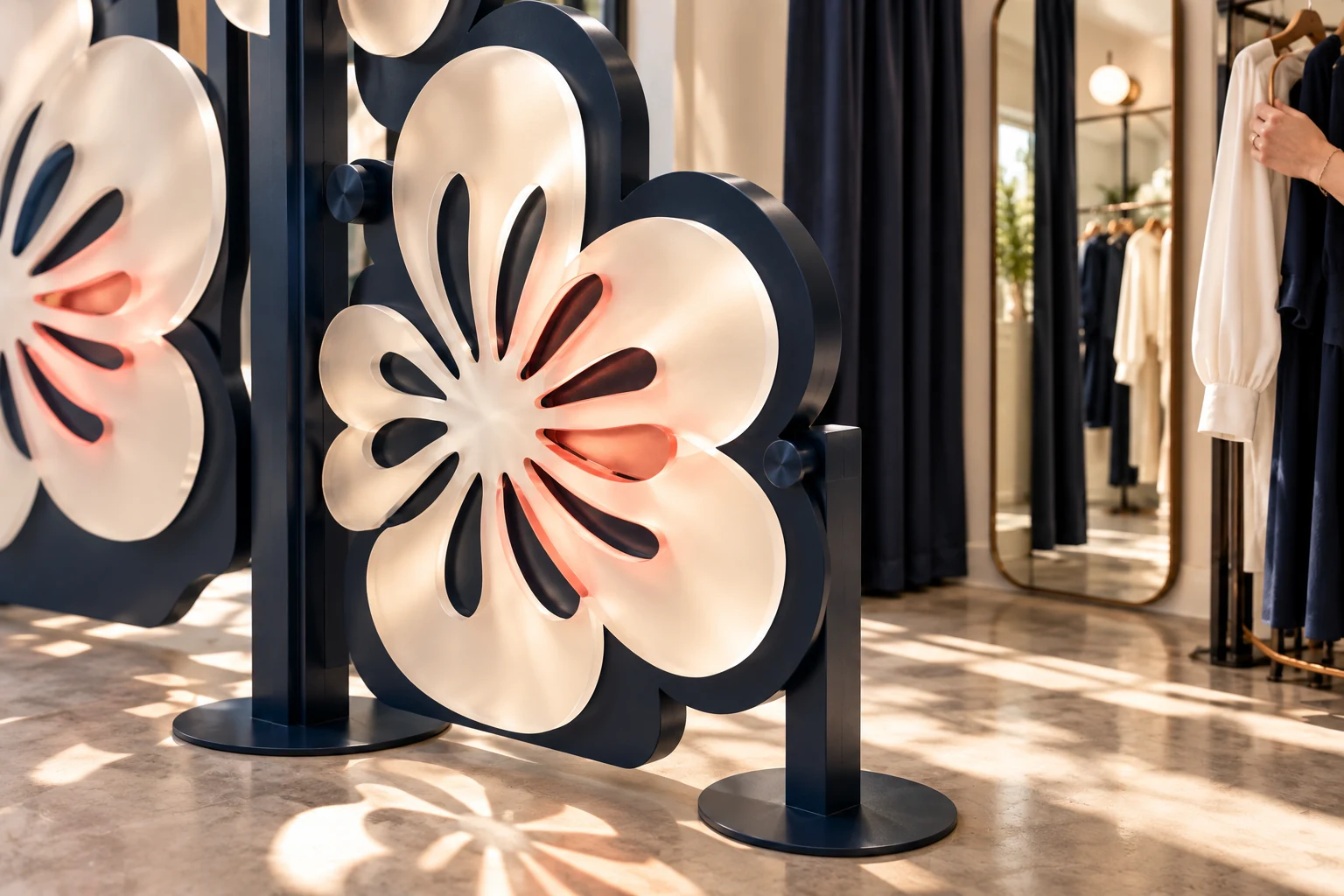
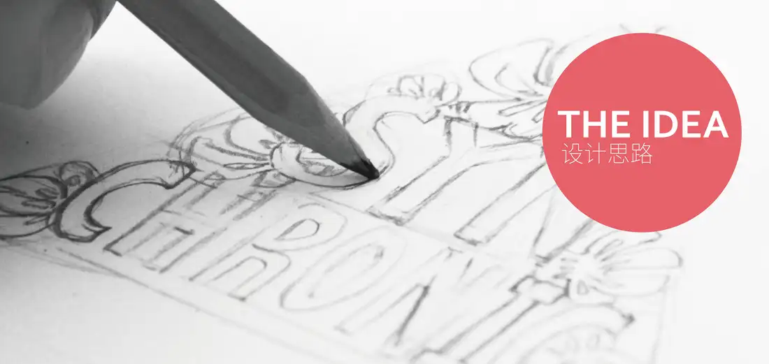
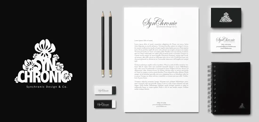
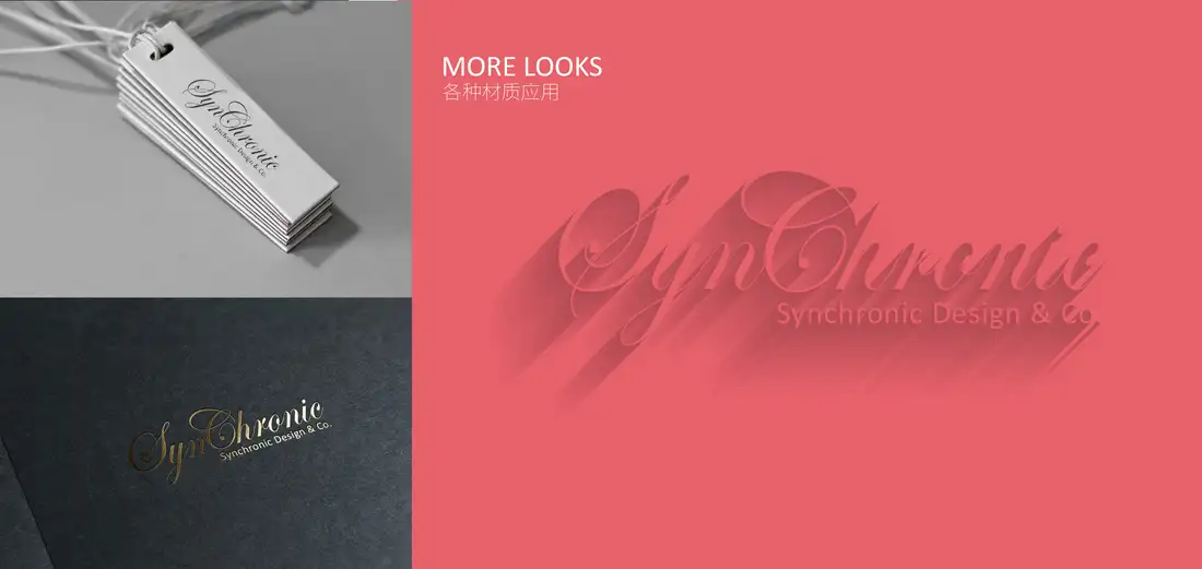
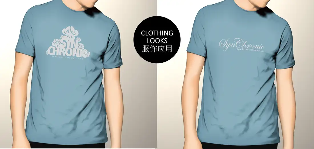
An independent, unbuilt retail-space proposal developed from the 2016 Synchronic identity. The original stacked SYN / CHRONIC letters and hand-drawn five-petal blooms become a human-scale fitting-room screen. Navy metal gives the lettering structure; translucent white petals filter daylight onto garments and the floor. The small coral detail comes from the original palette. These are concept images, not photographs of a built store or historical client work.
What stays recognisable
Keep the triangular stack, the complete readable SYN / CHRONIC name, the uneven botanical silhouettes growing around the type, and the original deep-blue, white and coral colour relationship. The fine script wordmark remains a separate, quiet signature rather than being forced into the large screen.
A system of parts
The letters form a load-bearing visual layer on a concealed freestanding frame. Flower modules attach at selected intersections and can vary in scale and translucency without changing the core mark. For fabrication, the proposed aluminum, resin, fixings and baseplates would need engineering and accessibility review before a real installation.
Why a fitting room
The identity is encountered at body scale, not merely printed beside the clothes. A customer moves through the letters; daylight passes through the petals and briefly redraws the pattern on the garment. This gives the original flower-and-type idea a spatial behaviour and a practical retail role.
What can change
Petal density, panel depth, light direction and the distance between layers can respond to each store. The stacked name, asymmetrical five-petal drawing and restrained palette stay fixed, so the system can grow without turning into a different brand.