Chromatic Decision Toolkit
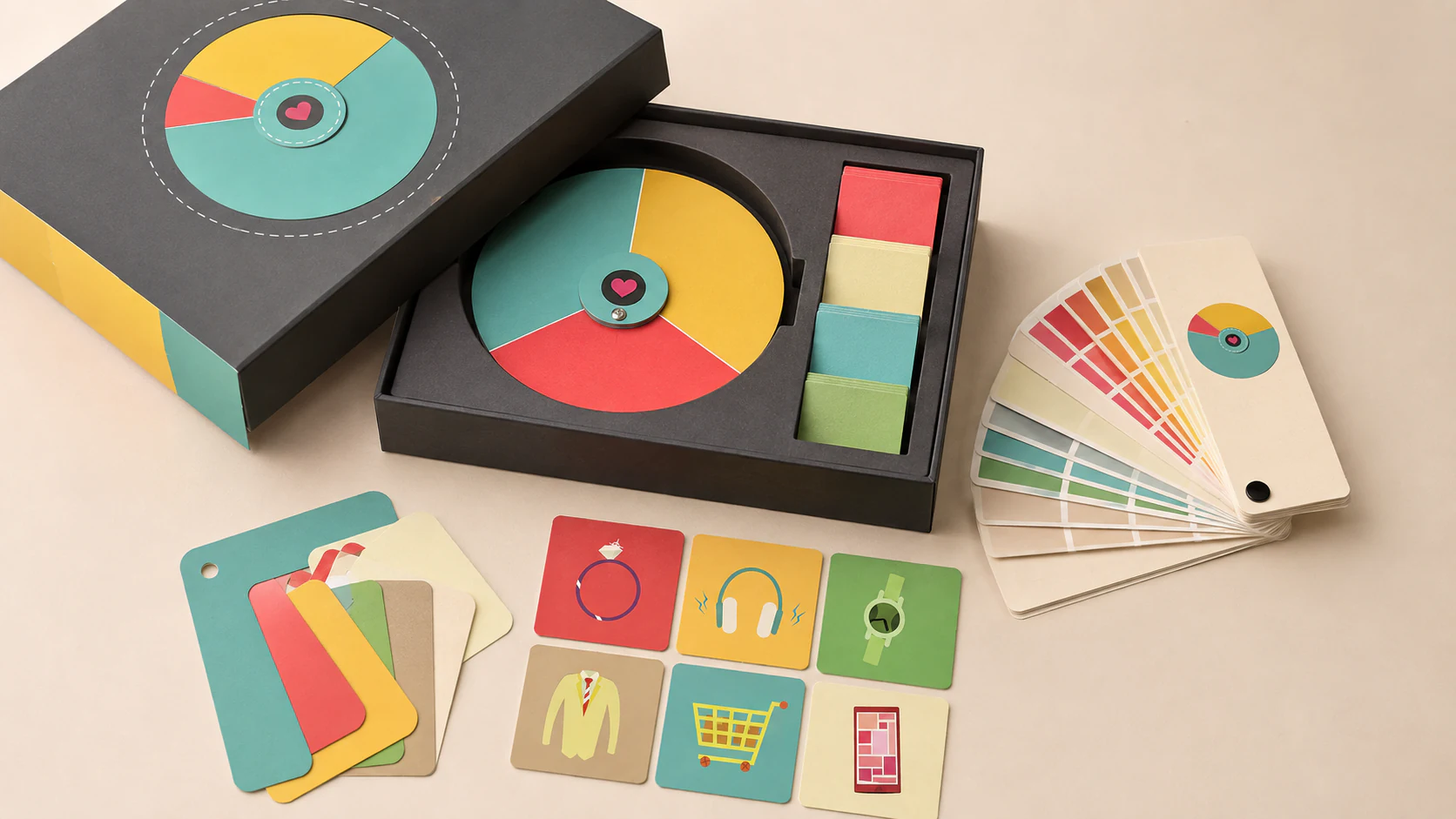
The original film made paint selection feel emotional rather than procedural. This studio extension gives that idea a physical form: a circular mood wheel, removable colour chips and scene cards become a compact toolkit for discussing colour before anyone opens a tin. The visual language stays playful; the materials and hierarchy grow up a little.
The Colour Commons
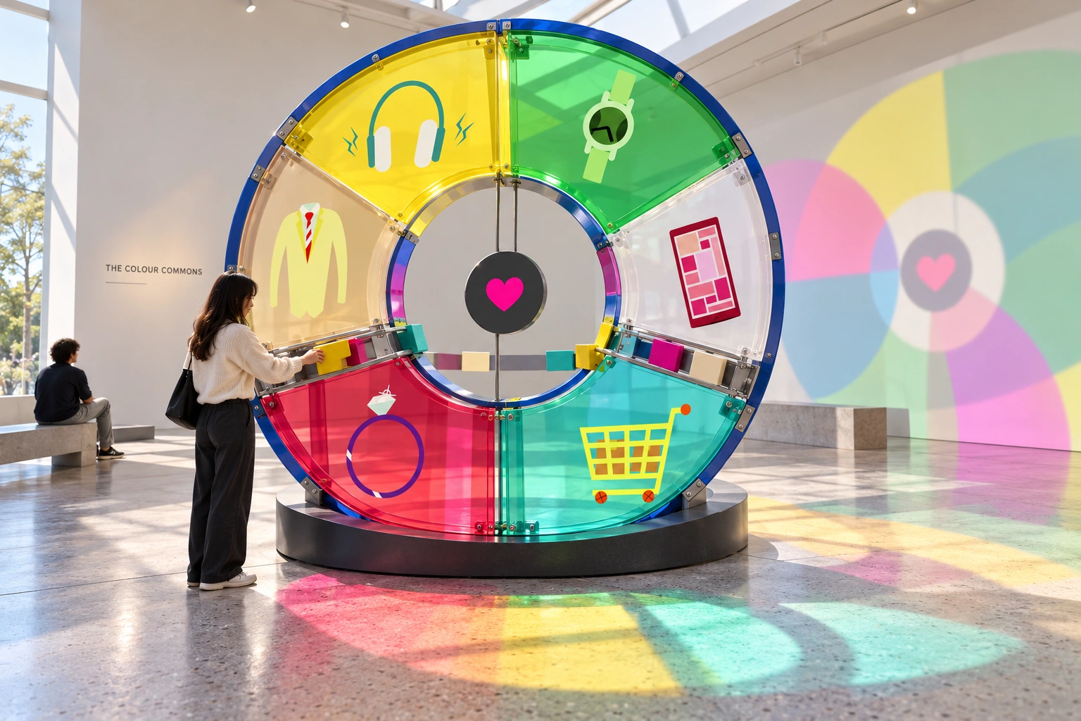
What if a colour chart were a place to meet? This independent studio extension takes the film's everyday objects and heart-centred circular graphic into a participatory spatial installation. Visitors adjust the balance of a shared spectrum; daylight carries the result onto the floor. The colour has left the chart, but it has not forgotten where it came from.
From evidence to participation
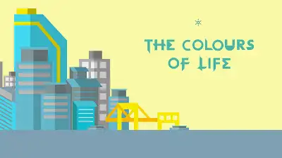
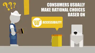
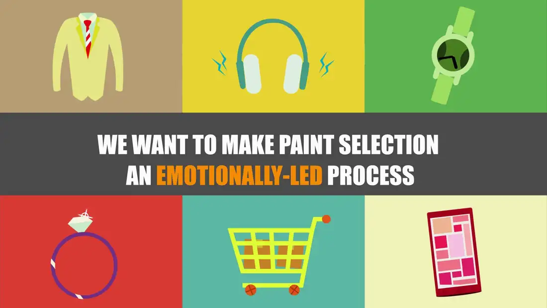
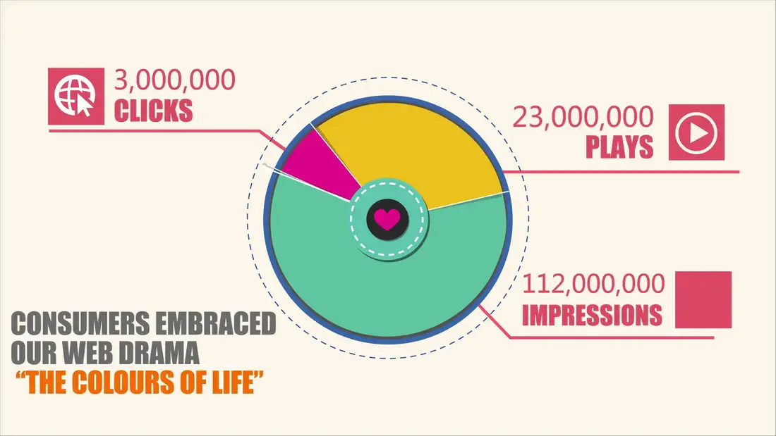
The 2016 work connected paint choices to familiar life: listening, getting dressed, keeping time, shopping, giving and staying in touch. Its circular graphic made a complex campaign legible. Here, the same circle becomes a gathering point rather than a scoreboard. The original campaign figures remain historical material above; this proposal introduces no new performance claims.
A grammar with six doors
The cobalt perimeter, charcoal heart hub, flat everyday-object symbols and teal, yellow and magenta accents are the recognition anchors. Six sectors give each object a place; relative area expresses emphasis, not a universal meaning assigned to a colour. The browser study makes those proportions adjustable. The system can change its sentence without changing its alphabet.
Colour becomes a material
Translucent panels turn a flat graphic into something that filters real light. Limited overlaps introduce secondary tones without asking the identity to become a generic rainbow. A segmented aluminium rim and visible fixings keep the construction readable. A charcoal base grounds the bright assembly, while the small central heart remains a quiet point of orientation.
Touch, compare, talk
Large captive colour blocks slide along an accessible rail; visitors can make a composition without carrying loose pieces away. Object symbols offer an alternative to colour-only identification. An adjacent light study translates the arrangement into a shared field. The intended setting is a design festival, paint showroom or community workshop: a conversation starter, not a personality test. Your headphones are not qualified to diagnose you.
Light is the motion system
Movement comes from the circle itself: shifting proportions, a slow rotation in the browser and daylight travelling through the panels. The prototype includes daylight and evening studies, manual rotation and a reset. It respects reduced-motion preferences and starts still. No autoplay spectacle is needed when the material is already doing something interesting.
An unbuilt proposal, with a practical next step
The render is a concept visual, not evidence of a fabricated installation. An initial envelope of approximately 2.3 metres in diameter would need a full-size reach study before dimensions are fixed. A fabricator must validate base stability, anchoring, panel impact and fire performance, captive-block retention and pinch clearances. Projection needs a separate optical or digital implementation; the browser is a rule study, not an installation controller. First prototype: one full-size sector, one rail and one seated user test.